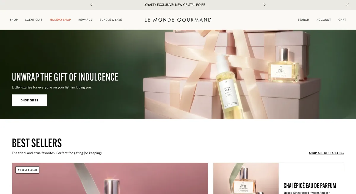
Le Monde Gourmand — The Holiday Shop
Campaign landing page for the 2026 holiday season, built as Shopify sections on the brand's own theme. Everything editable from the theme editor, with the store's cart and loyalty program left intact.
Visit live ↗- Shopify
- Liquid
- CSS
- JavaScript
- Figma
- Page Design
- Theme Development
- Client Delivery
- November 2026
- September to November 2026
- Le Monde Gourmand · Tru Fragrance + Beauty
- United States
- Nine custom sections, each shipped with a full schema and a preset
- Four-way quick finder sitting entirely above the fold
- Quick add wired to the store's own cart, gift-with-purchase and loyalty
- Touch carousels with a peek and a custom indicator
- Motion layer in plain CSS and JavaScript, reduced-motion aware
- Four design rounds in Figma with comments from the brand teams
The brief
Le Monde Gourmand is the gourmand fragrance brand in the Tru Fragrance + Beauty portfolio. For the 2026 holiday season they wanted one campaign page that gathered the whole gifting story in a single place: best sellers, sets, the new launch and body care, shoppable at any point down the page.
One condition framed everything else, and it was stated up front: less complex than the Rodeo Soul Harmony landing from the same group. Modular, Shopify-based, reusing the components the store already has. No separate headless build.
How it is built
Nine custom Liquid sections installed on the brand’s theme. Each one ships with a full schema and a preset, so the team can place, reorder and hide them from the theme editor without touching code.
Every piece of content is a field, not a line of code. Headings, copy, desktop and mobile imagery, calls to action, products through a product or collection picker, section order and per-section visibility. Each photo also carries its own framing — zoom and anchor point — with the final-round crops already set as defaults.
Quick add is the store’s own, not a new one. Reusing the theme’s product component is what keeps the cart drawer, the gift with purchase, the free sample, the loyalty program and the analytics tracking working. A custom card would have looked identical and quietly broken all five.
The motion layer is plain CSS and JavaScript, written to stay off the LCP: section reveals, hover states, arrow shifts, an animated marquee and a soft parallax on the editorial blocks. prefers-reduced-motion turns the whole thing off.
What took work
Touch rows on iOS. The mobile carousels scroll with a peek and a custom indicator. iOS rubber-banding pushed the indicator out of its track and widened the page, so the whole document slid sideways. Fixed by clamping the ratio, moving the thumb with transform once per frame, clipping the track’s overflow and containing overscroll-behavior-x on the row. Snapping went from mandatory to proximity, which feels far better on a row with a peek.
Smooth scrolling never reached the footer. The theme fixes the html height, so the scroll library was measuring a shorter page than the real one and stopping early. It now reads the real height. It also runs on desktop only: on touch, native scrolling beats any emulation of it.
The first screen, measured rather than estimated. The quick finder has to fit entirely above the fold across very different screens. Heights are written as a calculation against 100svh — the height with Safari’s toolbar visible — minus the header and what sits below, with a floor and a ceiling. Verified across the nine-size reference set, from 1366×658 to 390×844, and on real phones.
Delivery
Four design rounds in Figma with comment access for the brand teams, and a closed checklist pulled from the brief — 54 items — reviewed before every round. Each delivery ships with its own PDF guide: what each section does, which field controls what, and what is still open on their side.
The page went live on 3 November 2026, in time for the campaign comms kickoff. The push touched 18 files, all new and all belonging to the landing page, stamped before and after to show the theme’s other 491 files were left untouched.