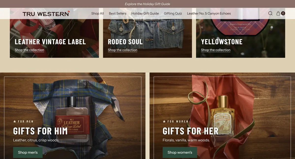
Tru Western — Holiday Gift Guide
Holiday landing page for the group's country-western brand, with a video hero cut like a film reel and eight gift sections shoppable without leaving the page.
Visit live ↗- Shopify
- Liquid
- CSS
- JavaScript
- Figma
- Page Design
- Theme Development
- Client Delivery
- November 2026
- September to November 2026
- Tru Western · Tru Fragrance + Beauty
- United States
- Video hero with film frame, code strip, sound button and end card
- Eight gift sections, all shoppable without leaving the page
- Anchor nav that drops its own links to sections the team hides
- Accent glints synced to the hero video loop
- Quick add wired to the store's own cart
- Four design rounds in Figma with comments from the creative teams
The brief
Tru Western is the country-western fragrance and body care brand in the Tru Fragrance + Beauty portfolio. This holiday landing is the sibling of the Le Monde Gourmand one: same brief, same deadline, same rule about reusing the existing theme, and a completely different visual world.
The hero
It is the piece that defines the page. A campaign video presented as a film reel: a one-pixel frame, a strip carrying the frame code, the season date and a sound button. At the end of the loop an end card arrives with the logo and its call to action, crossfading with the headline instead of cutting.
Three things that took work and never show, but are felt:
- The video’s first frame is the poster. There used to be a different fallback photo, and the jump when the video started gave the trick away. The poster is now literally frame one, in both aspect ratios.
- The glints follow the video, not a timer. Three passes per loop, pinned to the seconds of the edit. On a free-running timer the third landed around second 26 and got lost in the restart.
- Mobile is not desktop made smaller. The three beats of the end card moved to one height near the centre, and the type was scaled up: on a real phone it read small. Measured on an iPhone, not in the emulator.
The rest of the page
Eight gift sections, all shoppable in place: by price, by occasion, by collection, for him and for her, staff favourites, and a last rescue section for anyone still undecided. Below them, the season’s shipping deadlines.
The anchor nav and the sticky bar drop their own links for any section the team hides, and the scroll offset accounts for the header, the announcement bar and the sticky bar itself. If they remove Staff Favourites from the editor tomorrow, the index reorders itself with nobody touching anything.
Sections are named by their shape rather than the campaign — product grid, split panel, collection tiles — so next year they can carry something else.
What took work
A link that only appeared on mobile. The team added a link to a section heading from the editor and it never showed on desktop. The cause: the heading only carries a link on the right when it is split in two, and that section uses a centred heading, so the link had nowhere to go. Now, with a centred or left-aligned heading, the link drops centred below the products. The client found it, not the internal review: a section that never had that link in the design had one in the editor.
Images were being requested too small. The sizes attribute did not account for the framing zoom, so on mobile the browser picked files about 20% below what it needed and they looked soft. The zoom is now part of the calculation.
Delivery
Four design rounds in Figma with comment access for the creative teams, and a closed 57-item checklist pulled from the brief, reviewed before every round. Previews always ran on an unpublished theme built from a fresh pull of the live one.
The page went live on 3 November 2026. The push touched 26 files, all belonging to the landing page, stamped before and after: the theme’s other 464 files, its index and its settings were left untouched.